Or at least a better organisation of the information.
Hello fellow members! You all know that I love this project, but I think that we need a more appealing UI. The current user interface is too technical.
As a user, I dont want to “swap”, “cover”, “claim”, “stake” or “govern”.

As a cover buyer, I want to get a cover.
As an investor, I want to supply capital.
Who is the audience of Nexus. Who is the persona?
Do we want to depend only on resellers like Armor to address end user (retail investor)?
- If this personna is a Defi user: we need to have a better UX.
- If this personna is an intitutional user: the current interface is not suitable for resellers
I every screen there is a mix of information for “users” and for “mutual members” (I know we are all members of the mutual.).
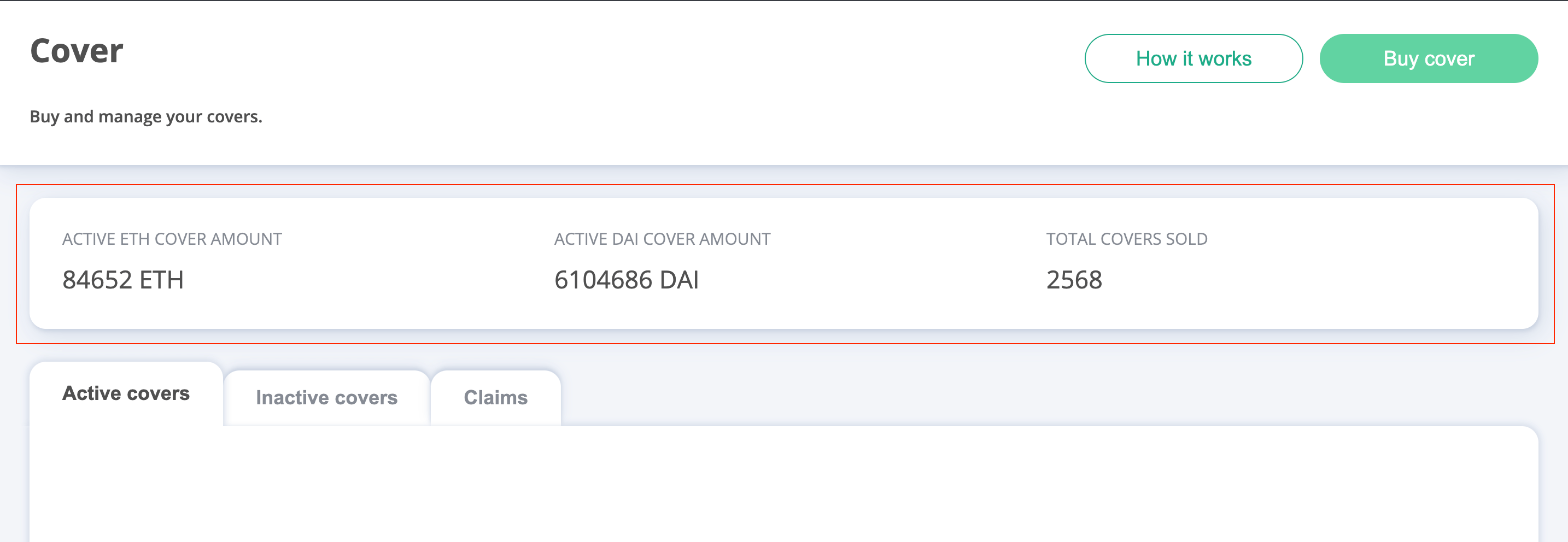
If I am a “user” that wants to get a cover, none of this informations (in the red box) is actionable. Pure “member” stats.
I’d prefer to see personal stats, like how many active covers I have or total covered assets.
And why is there a “Claims” tab, despite that there is a similar item in the main menu? Because the “Claims” page is for Claims assessor and not for covers buyer.
If you also think the UI needs a rework, let me know, and I’ll take some time to come up with (i hope) a better architecture.